I grabbed the wrong graph in that last post. A good graph but what I meant to post was the GDP chart. From the same Calculated Risk blog:
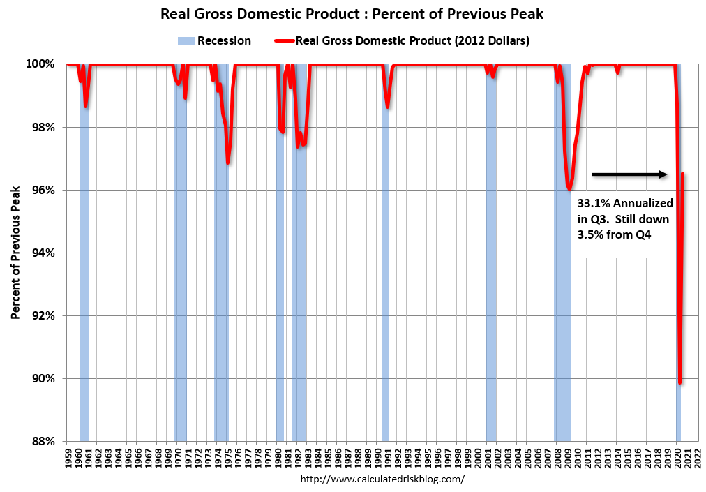
I grabbed the wrong graph in that last post. A good graph but what I meant to post was the GDP chart. From the same Calculated Risk blog:
A chart of personal income, less transfer payments, from the Calculated Risk blog. Pretty big leg down during covid-19.
